
Introduction: A Retro Revival with Purpose
In a digital era where minimalist design and dark modes reign supreme, designer and developer Nic Chan has carved a unique niche by launching a delightfully retro website. But this is far from a nostalgic gimmick—Chan’s website is a standout example of how vintage aesthetics can be paired with modern principles of usability and web accessibility. Drawing inspiration from text-heavy interfaces of early computer systems, this site manages to be both visually engaging and extraordinarily accessible.
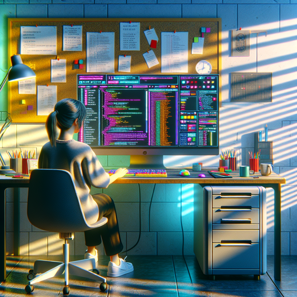
By incorporating design choices reminiscent of the late 90s and early 2000s, such as monospaced fonts, ASCII art, and a vibrant neon color palette, Nic Chan’s website evokes a sense of digital nostalgia. However, beneath the charming exterior lies a platform engineered to meet the digital needs of a diverse range of users. Let’s dive deeper into how this website sets a new standard for combining artistic expression with inclusive design.
A Look at the Design Inspiration
Retro Aesthetic Infused with Modern Intentionality
Chan’s personal website is a loving homage to early web culture, drawing cues from command-line interfaces and vintage email clients. A few of the most notable design choices include:
- Monospaced fonts that mimic coding environments
- ASCII borders and decorative elements
- Bright contrasting colors and neon highlights
- Simple, minimal animations that respect user preferences
While such choices might seem purely stylistic, every design decision has been carefully assessed for its impact on usability and recognition. Instead of being just quirky, these elements support faster comprehension and better readability, especially for users who rely on consistent visual cues.
The Bold Push Toward Accessibility
Breaking the Mold of Conventional Design
Where Chan’s work truly shines is in its approach to accessibility. While many websites pay lip service to inclusive design, few achieve the degree of thoughtful execution showcased on this site. Here’s what makes Chan’s approach truly exceptional:
- Keyboard navigation is seamless and intuitive, with visual indicators clearly showing focus states.
- High color contrast throughout the site ensures readability for users with visual impairments.
- Screen reader support has been meticulously implemented, thanks to semantic HTML structures and ARIA labels.
- The design also respects system preferences, such as prefers-reduced-motion, which allows animations to scale down—or turn off entirely—based on user settings.
Chan’s understanding of accessibility transcends checking boxes. The website was crafted from the ground up with inclusive, user-first development practices. This results in a digital experience that’s inviting, not exclusive.
How the Website Serves as a Learning Tool
Chan has gone a step further by turning their website into a kind of case study for others in the design community. The “Now” and “Readme” sections double as educational resources where Chan explores the rationale behind their decisions.
Transparency Builds Trust and Community
One of the biggest takeaways for anyone experiencing Chan’s site is how transparency breeds trust:
- Chan includes notes on how accessibility was approached during development.
- There are references to WCAG (Web Content Accessibility Guidelines) compliance checkpoints.
- Chan openly reflects on what might still need improvement, inviting users to provide feedback.
By exposing the “why” behind the “what,” the site becomes more than a digital business card—it becomes a lighthouse for principled design and collaboration.
Why Retro Works in 2024
The Digital Nostalgia Trend Meets Functionality
We often see retro design as an exercise in fun or rebellion. But Chan’s website proves that vintage-inspired interfaces aren’t just a stylistic choice—they can enhance usability with the right execution.
Here’s why retro works so well in a modern context:
- Familiar visual cues: Even new users find elements like document-style formatting and command-line motifs surprisingly intuitive.
- Simplicity over complexity: Channeling old-school design forces creators to strip back unnecessary clutter, creating cleaner and faster experiences.
- Low-bandwidth friendly: These designs are lightweight and optimal for users in regions with slow internet connections—a crucial accessibility point often overlooked.
In other words, going retro isn’t just stylish—it’s strategic, especially when paired with a focus on accessibility.
Impact on the Design and Developer Community
Raising the Bar for Independent Creators
As an independent designer, Nic Chan’s efforts resonate with a growing community of freelance developers and creatives who are increasingly looking for unique ways to express their personality on the web, without compromising on quality and best practices.
What others are learning from Chan’s website:
- You don’t need a big production budget to create something impactful.
- Good design is in the details—from color choices to semantic markup.
- Web accessibility is achievable and should never be an afterthought.
Chan’s website serves as proof that anyone with a passion for both design and function can shape their own corner of the internet. And more importantly, they can do it in ways that include, rather than alienate, all users.
Technological Stack Under the Hood
Much More Than Meets the Eye
While the aesthetics are retro, the backbone of Chan’s website is quite modern. Built with HTML5, CSS Grid, and simple JavaScript enhancements, the site ensures a seamless experience across modern browsers and devices.
Chan intentionally avoided overdependence on JavaScript frameworks, opting instead for a lightweight, performant experience. This not only contributes to better accessibility but also aligns with sustainable web practices—an increasingly relevant consideration in today’s climate-conscious development world.
User Experience in Focus
Intuitive Interactions and Quick Learning Curve
Despite its unconventional look, new visitors can easily figure out how to navigate the site. Chan has included strong onboarding cues such as:
- Accessible labels and alt text on all interactive elements
- Keyboard-friendly shortcuts and clear tab structure
- Logical content hierarchy, ensuring screen readers and assistive tools understand the content flow
This attention to detail means that whether a visitor is using a screen reader, browsing on a tablet, or navigating via keyboard, they’re welcomed into a thoughtful digital experience.
Conclusion: A Blueprint for the Future of Inclusive Web Design
Nic Chan’s retro-inspired website defies modern design conventions without sacrificing accessibility, performance, or user-centered principles. It’s a masterclass in how form and function can coexist, not just peacefully, but powerfully.
For designers, developers, and digital creators, this site is more than inspiration—it’s a roadmap. From intentional HTML architecture to vibrant, nostalgic visuals, every aspect of the site serves a dual purpose: **personal expression and universal usability**.
As we move further into an era where the web must become more inclusive by design, Nic Chan’s website sets a compelling new standard. Whether you’re designing your own portfolio, launching a blog, or rethinking UX for a client, her work provides one clear message: retro can be revolutionary—and accessible to all.